Facebook is a very visual platform; their re-design is even more focused around imagery. It’s known that images on Facebook drive 94% more total views, and there is a 37% higher engagement rate for photos over text. Let’s look at one way we can consistently create visually interesting imagery that we can use to drive user engagement on your Facebook page.
Rule of Thirds
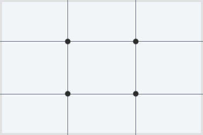
The Rule of Thirds is a principle used in photography to enable the creation of visually interesting images. We take the image area and divide it into 9 parts using vertical and horizontal lines:
This creates 4 points that are regarded as the most interesting areas of the image; the eye will naturally be drawn to those points, and this tendency is used as a way to guide the viewer around the image by placing the subject at or near them:
Many of today’s cameras and camera apps have the rule of thirds grid built in, so check your camera or app settings to enable it if it is not enabled.
Selecting Photos
When selecting photos from imagery that’s already been created, try to choose those that have a clear subject, as this makes it easier to use the Rule of Thirds when placing the image as a cover photo.
Examples
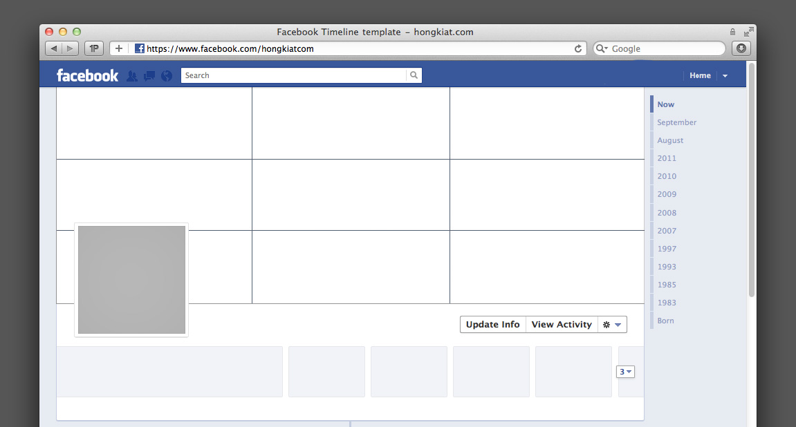
Let’s see the Rule of Thirds in action when applied to creating a Facebook cover photo. Here are a few examples that really illustrate the technique:
Extra Space Storage (client)
Things Remembered (client)
These are only a few examples of how brands create visually interesting and engaging cover photos using the Rule of Thirds.


