 With Twitter’s announcement last week about the new photo tagging and collage features and Facebook’s implementation of the 20% rule, image-centric marketing is quickly overtaking traditional text-based media. Twitter reports that tweets with a photo are 35 percent more likely to get retweeted than one without. New York University psychologist Jerome Bruner has done research that demonstrates that people only remember 10% of what they hear, 20% of what they read, and 80% of what they see and do.
One of the most underestimated elements of advertising is typography. Typography is the art and technique of arranging type. Considering all of the advertising placed in front of consumers via feeds, it’s important to use type that quickly grabs a reader’s attention and gives a clear understanding of the message. Below are 5 typography terms that will help.
HIERARCHY
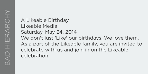
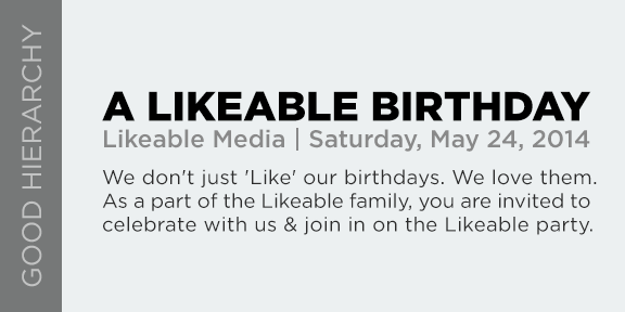
When designing anything, it’s important to figure out how you’re going to structure the elements. What is the first thing the viewer should look at? How bold or big should the headline be? Are the images and text competing? Is there one unified design? Creating a logical hierarchy in your designs make them easier to scan, read, and stand out.
WEIGHT
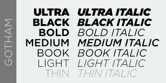
Within a majority of typefaces, there are often more than one style and/or weight. Weights come in different forms such as: “light,” “thin,” “regular,”“medium,”“bold,” “heavy,” or “black.” Each of these refers to the thickness of the strokes that make up the characters. Combining different weights of a typeface can also help with hierarchy.
TRACKING
Tracking is the space between characters in a piece of text and can be described as being “loose” or “tight.” Loose tracking is when the letters have a larger distance between them. Tight tracking is when the letters are closer. Each time you set type, you should be looking at the overall picture.
LEADING
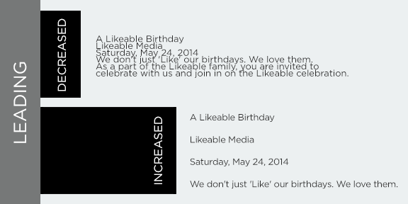
Leading (or letter spacing) is the space between lines of type. Increasing leading by adding more white space can reduce the pace of reading text. Decreasing leading by making the text appear more compact can increase the pace of the reader.
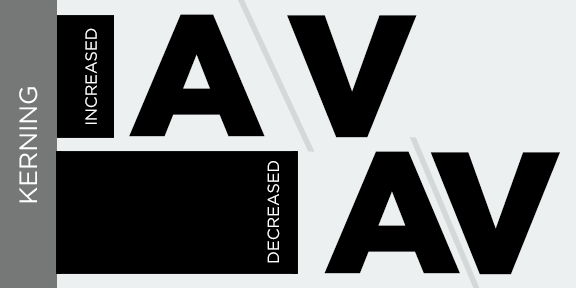
KERNING
To kern is to adjust the spacing between a pair of letters, numerals, or punctuation. Kerning is the art of adjusting the space between characters so that the eye can flow easily across the copy without being distracted by discrepancies.
Typography influences how readers process information, and the most successful typography also engages the consumer. Typography is important in advertising because it tells the consumer what he or she is reading and why it’s important. When used properly, the message is not only meaningfully conveyed, but also strengthens the brand.
Note: Good typography is never noticed.
