Recently, Facebook implemented a limitation on the amount of text that would be allowed on an image in order for it to be used as an ad. Let’s look at a more efficient way of ensuring that our images meet this requirement!
The 20% Rule, for those who need a refresher, requires that text takes up, at most, 20% of an image used in an ad. More specifically (via Facebook):
Allowed in the 20% text policy:
-
Pictures of products that include text on the actual product
-
Photos of products in real situations or photos of products with a background
Not allowed in the 20% text policy:
-
Images that are zoomed in on logos/images with text overlay
-
Images that are clearly edited to include text on the product as a loophole to policy
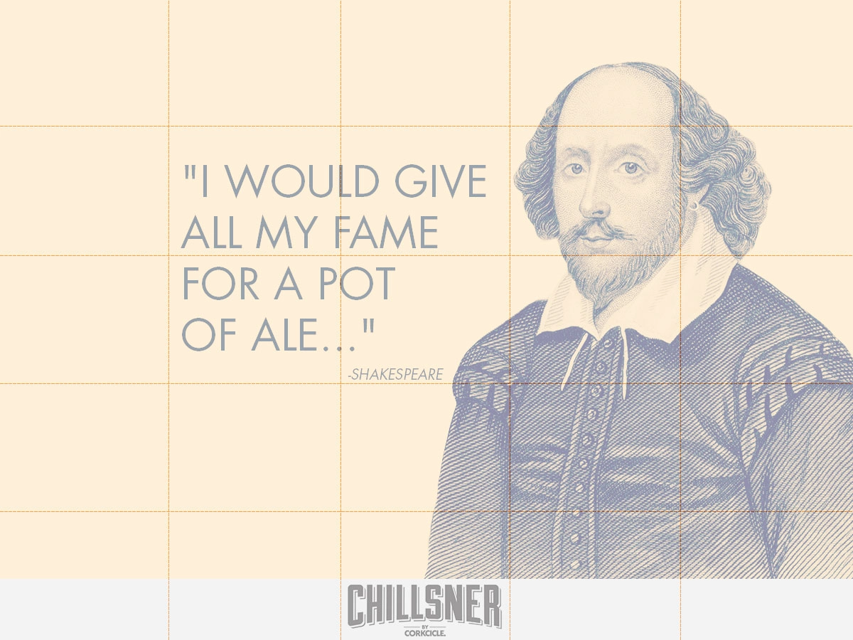
Facebook has provided a Grid Tool that helps ad and content creators adhere to the 20% rule. When using the tool, 20% equates to having text be present in 5 of the boxes. The drawback to using the tool is that one has to constantly visit the link and upload different versions of images to test. One solution to this–if working in an image editing program that supports layers–is to create an overlay. You can then place guides or dim the overlay so that you’re able to view the grid while still editing your image.
I’ve included an example along with a sample overlay below. Enjoy!
Image overlay:

Example of content image using the overlay:
What other tools or tricks do you use when creating visual content for social media?


